

.svg)
I was approached by the company founder to create a flexible brand identity that would add consistency and organization to a shopping experience that was historically cluttered and chaotic.
6 weeks
Brand identity, logo design, typography, commerce design
Sari-Sari stores are common neighbourhood variety shops in the Philippines, often characterized by a cluttered shopping experience. The Sari-Wow! founder aimed to improve the shopping expertience by introducing a standardized concept store that retains its local charm.
The business owner aimed to instill national pride in the branding through visual references to beloved motifs.
The brand identity aimed to convey warmth and positivity, encouraging people to enter the store.
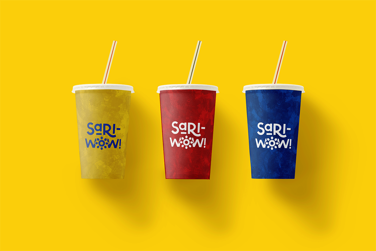
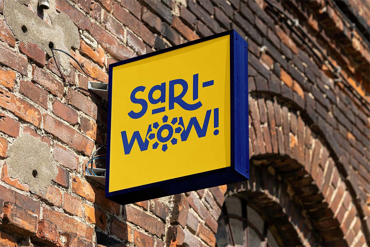
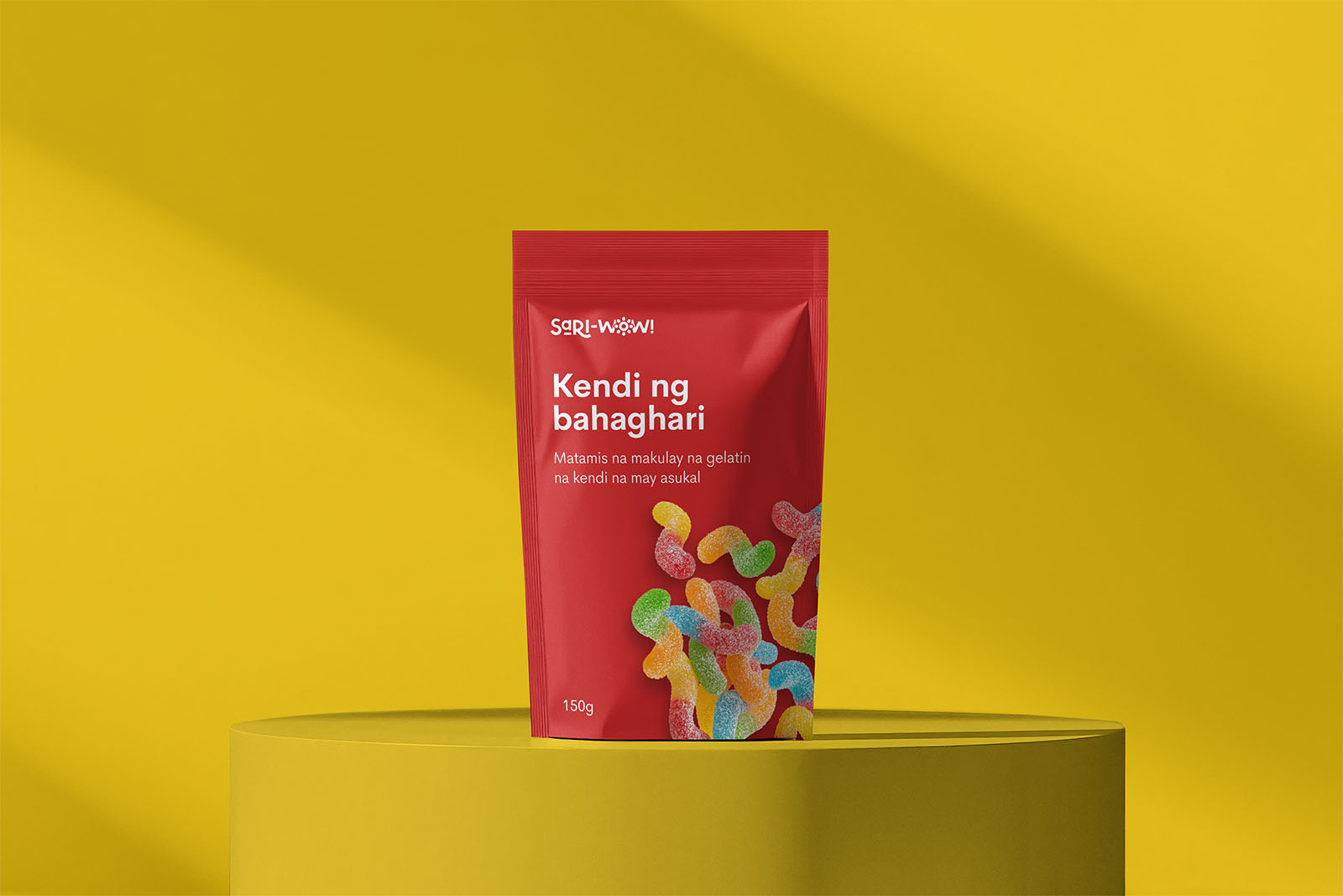
The brand identity had to be versatile enough for use in signage, packaging, uniforms, interiors, and print materials.
The founder provided rough logo mockups inspired by the Philippine flag. While not directly usable due to readability issues, they served as a solid foundation for the desired aesthetic.
We used the primary colors from the National Flag, which were flexible and eye-catching while appealing to the general population.
The "Sari-Wow!" logomark includes a simplified version of the Golden Sun, invoking national pride and positivity.
Early designs combined the sun with a brush-style font, echoing handwritten signs. We shifted to a simpler concept for practicality, choosing a sans-serif with charming imperfections.


(2).jpg)

From his descriptions and photos, the typical experience in a Sari-Sari store can be disorganized and a little chaotic. A cohesive brand identity, combined with better organization, would significantly improve the shopping experience.
.png)