
.svg)
As their business grew, Browning's owner approached me to transform their DIY'd logo design into a full-fledged corporate identity.
Timeline: 6 Weeks
My Role: Logo design, brand strategy, corporate branding
Browning Fire Protection is an Edmonton-based, family-run fire protection company. As their company grew, they approached me to design a strong brand identity that emphasized their core values:
Browning set themselves apart with high standards for integrity, ethics, and commitment to safety.
With over 50 years' combined experience in fire alarm and life safety, the company wanted to highlight their unparalleled expertise in the field.
As born-and-raised Albertans, the owners car deeply about protecting their local community.
We first met to discuss strategy, so that the final identity would align with the business' values and goals, and appeal to their target market. During that time, we established key deliverables, drafted a moodboard, and established some project constraints:
🔶Revamp, not replace
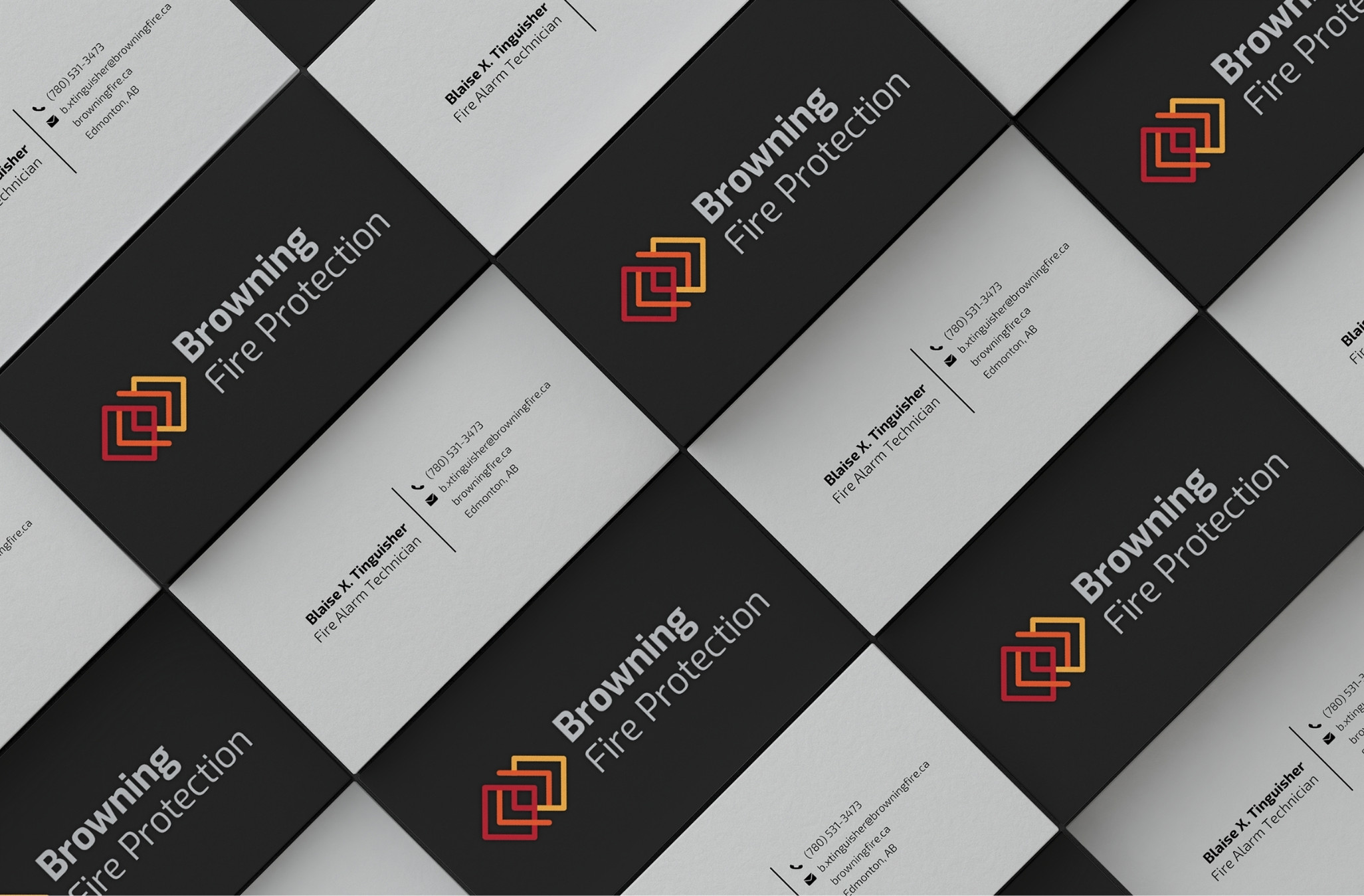
Since customers were already familiar with the triple-diamond icon, we chose to revamp rather than replace it.
🎨 Keep brand colors
Retain the existing brand colors, which had already been used in office decor and other permanent applications.
🤝Personal Touch
As a small business with Albertan roots, the company wanted to convey a sense of community connection within the new identity.
I experimented with combining different shapes with the existing diamond symbol. The final logo is a combination of the following symbols, representing the values of the business:
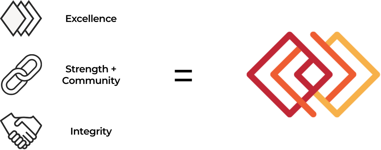
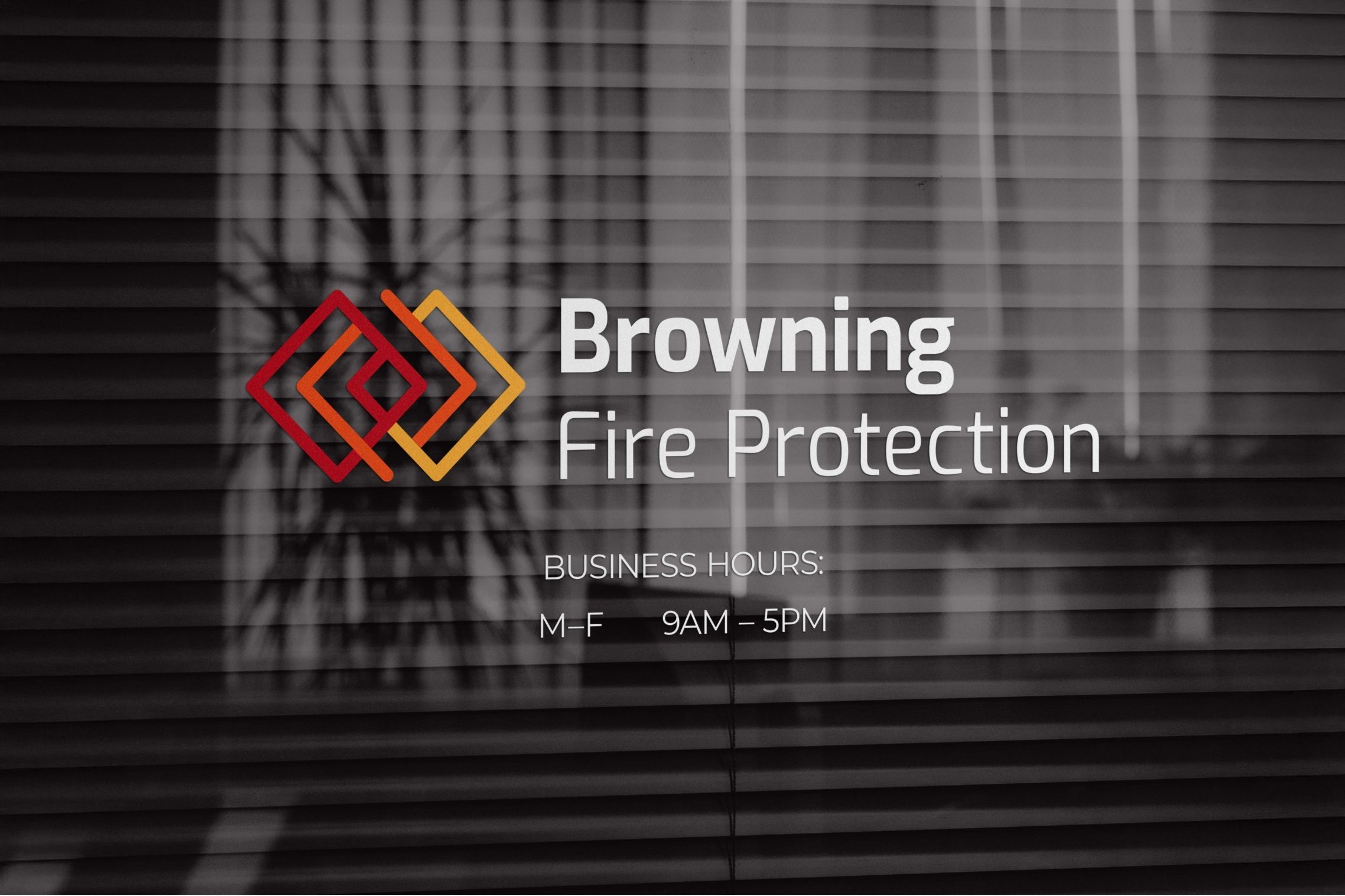
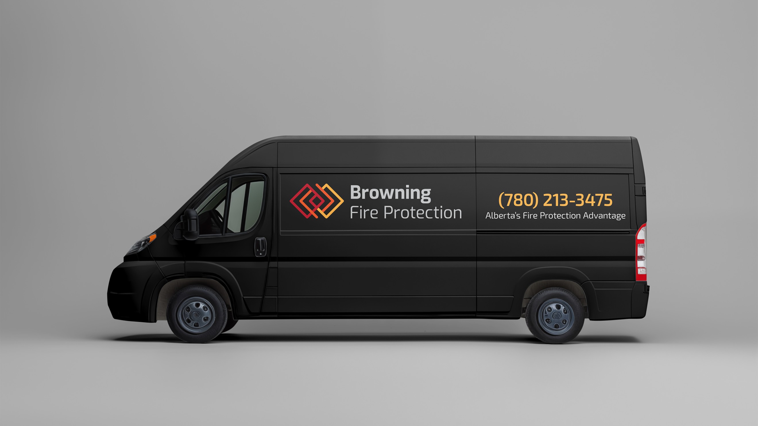
The "Diamond Chain" symbol is also used as a decorative element across other deliverables, such as stationery, interior design, web, and print.
.jpg)


This was one of my first freelance projects. After a few attempts at freelancing marred by inconsistent process and endless revisions, this project was, comparatively, a breeze. Both the client and I were happy with the results, and the design and hand-off processes were much smoother than before.
Before discussing visuals at all, I sat down with the owner to discuss the business: its history, beliefs, and goals. This helped me understand their perspective, put us on the same page from Day 1. Understanding the business' needs helped me design with insight and strategy, rather than just "ideas".
After discussing with the owner, I took some time to analyze both local and national competitors' visual identities. This made all the difference, both to understand the visual conventions of the industry, and to avoid what other businesses were doing so I could help my client stand out.
.png)